Announcing the Science Discovery on Main Street Grant Recipients
Main Street America is thrilled to announce the 12 Science Discovery on Main Street grant program recipients.
Learn data-based solutions to complex challenges at the 2025 Community Transformation Workshop in Columbia and Hartsville, South Carolina, October 13 – 15.
Learn More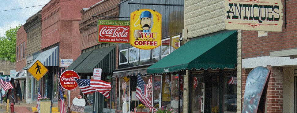
Drive out to the edge of town. Stop at the city limits and take a moment to survey the scene. Now head downtown. Look at the streetscape along the way. What do you see? Is the scene pleasing? Does it make a good first impression, or is the streetscape ugly and cluttered?
Our communities are ever evolving as we build new buildings, improve facades, plant trees, introduce sidewalk dining or paint outdoor murals – but one thing that remains constant across streetscapes of past and present is signage. Sign control – or the lack of sign control can have a significant impact on your community’s appearance and economic competitiveness.

Sign regulation is one of the most powerful actions a community can take to make an immediate, visible change in its physical environment. Properly drafted and enforced sign controls can reinforce the distinctive design quality of the entire community. The image of a community is fundamentally important to its economic vitality and the signs along a community’s streets can greatly affect the image of a place. Is the town ordinary or special? Ugly or beautiful? Classy or trashy? Tacky or quaint?
We need signs. We can’t get along without them. They give us direction and necessary information. As a planned feature, a business sign can be colorful, decorative, even distinguished. So why talk about the sign problem? The answer is obvious: Too often signs are oversized, poorly planned, badly located, inappropriately lit and altogether to numerous. The debate around signage is not new. The American Planning Association has noted that “perhaps no environmental or land use issue evoked more discussion or debate in the 1950’s and 1960’s than did aesthetics and sign control.” That early period kicked off efforts to regulate signs across the country, but the issue is still relevant today.
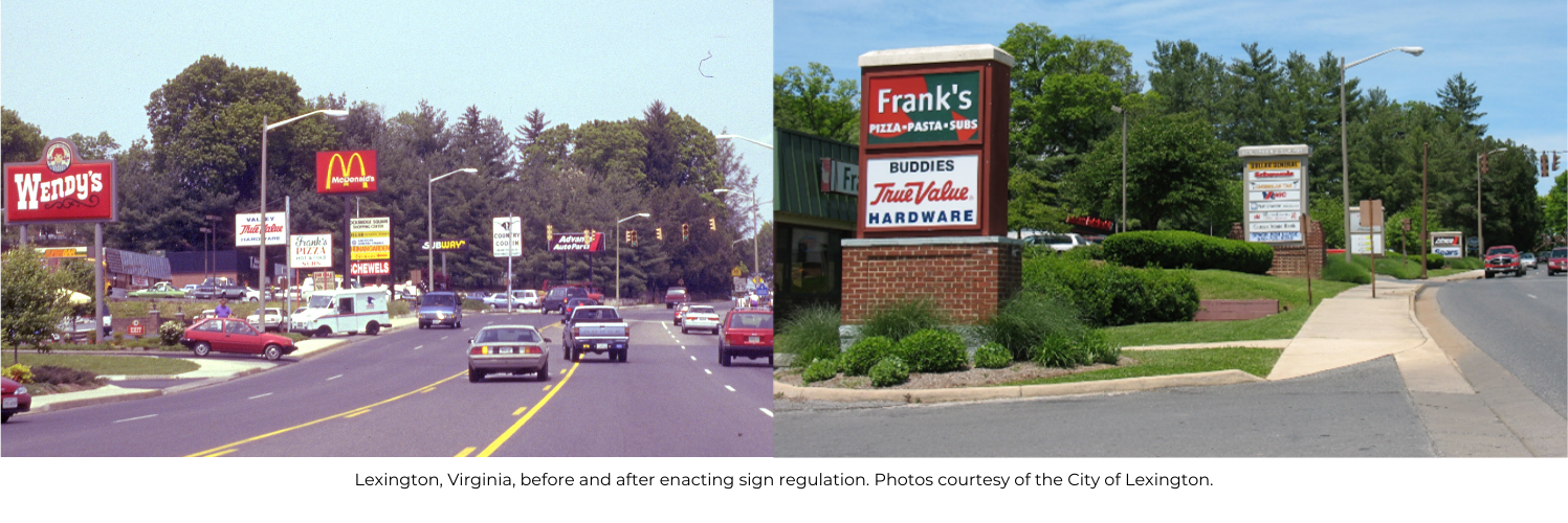
In many towns sign clutter dominates the landscape, overshadowing buildings and trees, eroding community character, ruining scenic views, degrading historic ambiance and blighting entire neighborhoods. Some communities allow signs in such profusion that drivers must scan a confusing smorgasbord of clutter to find what they are looking for. Other, more successful communities control the size, height, number, and materials of signs. The result is a more pleasing, inviting streetscape that beckons consumers instead of confusing them.
Sign clutter is ugly, costly, and ineffective. When there is an overabundance of competing signs, the message of each is lost. One businessperson explained it this way: “When everyone shouts, no one can be heard, when all speak softly every voice becomes distinct.”
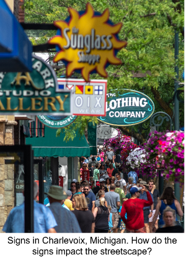
A good sign code is pro-business because an attractive business district will always attract more customers than an ugly one. Moreover, when signs are controlled, merchants do a better job of selling at less cost. Indeed, studies on visual perception have shown that when the size and number of signs are reduced, the viewer sees more not less. Lindsey Dotson at the Charlevoix, Michigan Main Street, DDA praised their sign control program, saying, “It has led to a universally pleasing streetscape that still allows a business to speak to different audiences (a car passing by, a pedestrian strolling down the block, a window shopper) in an effective yet not cluttered fashion.”
Sign control is especially important to communities that seek to attract tourists. Why? Because the more one town comes to look like every other town, the less reason there is to visit. On the other hand, the more a town does to protect and enhance its unique assets, the more tourists it is likely to attract. Tourism is about visiting places that are different, unusual, and unique. Homogenization and over-commercialization turn tourists off. If everyplace was just like everyplace else, there would be little reason to travel anyplace.
In this article I will outline key legal, political and practical aspects of on-premise sign regulation. See the sidebar for more information about on-premise versus off-premise signs.
Sign regulation raises several legal issues. These issues do not prevent effective regulation of outdoor signs. However, sign codes must be carefully drafted to avoid legal challenges. Signs codes should always be “content-neutral”, and like any regulation based on the police power of local government, sign codes must advance a public interest related to the preservation of the public’s health, safety, or welfare.
Courts routinely uphold sign codes under two separate aspects of police power. First, courts uphold sign ordinances as traffic safety measures, reasoning that signs can distract drivers. Second, many court decisions, particularly in recent years have upheld the power of a community to maintain or improve its appearance through aesthetic regulations that are related to the general welfare.
1. Portable and Sidewalk Signs
Portable signs are the junk mail of the streetscape. They move around, get in people’s way, and clutter up sidewalks in many commercial areas. Portable signs are almost never allowed in shopping malls or other controlled environments. They are likewise out of place on Main Street. Not only because they are unsightly and unnecessary, but also because they are unsafe. They can blow around in high winds or stormy weather and can be a hazard to the handicapped and visually impaired. Sidewalk signs may well violate the Americans with Disabilities Act (ADA).
Sign ordinances typically define a portable sign as “any sign which is moveable, and which is not permanently attached to a building, structure or the ground.” There are two approaches to regulating portable signs: for temporary display only – e.g., 30 days a year for sales, grand openings, etc. This approach however has two problems. First, it is almost impossible to administer and enforce. Second, courts are more likely to strike it down, questioning how a portable sign can be a safety hazard and aesthetic concern at certain times but not at others. In my experience, from both a legal and a practical standpoint, the simplest solution to regulating portable signs is to prohibit them outright.
2. Wall Signs
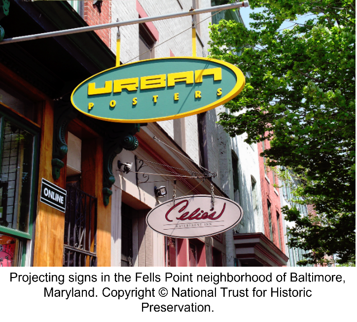
Wall signs are attached to the wall of a building. The design of the building usually dictates the best location for a wall sign. Such signs should be limited in proportion to the size of the building and not exceed a certain maximum size. For example, a typical sign ordinance might allow wall signs up to 150 square feet or 15 percent of the frontal area, whichever is smaller. Wall signs should also not obscure windows or other key architectural details.
In addition to wall signs, some ordinances allow one hanging or projecting sign mounted at a right angle to the building. In general, projecting signs should be limited in size, and the ordinance should require that the sign be constructed of materials appropriate to the building and its setting.
3. Freestanding Signs
Freestanding signs are signs held above the ground by a pole or other structure and not attached to a building. There are two types of freestanding signs: pole signs and ground signs. Their principal use is for business identification outside of the downtown commercial core.

Pole signs are elevated above the ground by a pole or other structure. In some commercial areas, overly tall pole signs proliferate creating a unattractive, cluttered appearance. Effective sign ordinances typically limit a business to one freestanding sign with a maximum height of 12 to 15 feet. Signs much taller than this are difficult to see through an automobile windshield. Reducing sign height also saves merchants money and makes it easier for signs to do the job they were meant to do.
In some communities, businesses engage in a destructive competition to see who can build the biggest, tallest, most attention getting signs. Ironically in such a competition both the businesses and the community lose. When there is an overabundance of competing signs, the message of each is lost. What’s more, the community becomes over-commercialized and homogenized turning it into “Anywhere USA”.
As a result, a growing number of cities are prohibiting pole signs, allowing only ground mounted signs, also known as monument signs. Ground signs as the name implies are low to the ground. They are typically used by vacation resorts, planned communities and other cities that seek a distinctive identity. Hilton Head, South Carolina, Reston, Virginia, Sedona, Arizona, Columbia, Maryland, Williamsburg, Virginia, Chapel Hill, North Carolina and The Woodlands, Texas are all examples of communities that prohibit pole signs in favor of monument style signs.
4. Flags, Pennants and Banners
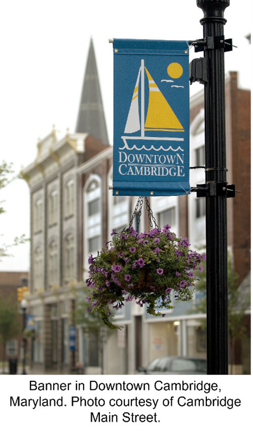
Many cities have ordinances that prohibit pennants, banners, balloons, and inflatables because of their distracting nature. Regulating flags and banners, however presents problems that require special attention. It is almost certainly unconstitutional to prohibit the display of the US or other official flags. Yet everyone is familiar with the car dealers and other merchants who display enormous American flags, far larger than any permitted sign. To address this problem, communities can limit the height of flagpoles and the size of flags. In addition, communities can regulate all non-official flags – the McDonald’s flag for example – as signs subject to normal size and height limitations.
Official banners in a downtown can add color and interest to the streetscape. So how can a city ban commercial banners that say, “Sale Here” or “Open Today” and still allow decorative banners for special events or seasonal decorations? The answer is simple: prohibit banners except as “temporary signs on public property (e.g. street lights) to promote events of general civic interest, subject to a special permitting process.”
5. Historic Signs
Cities in their efforts to clean up unsightly commercial clutter, sometimes throw out the good with the bad. Old painted wall signs, barber poles, neon, porcelain, and other signs of outstanding craftsmanship or design frequently run afoul of local ordinances designed to clean-up sign clutter or foster a distinctive design image.
Unlike homogenized, plastic backlit signs so prevalent today, unique, hand-crafted signs from the past are often worth saving. Peter Philips of the Society for Commercial Archeology describes old historic signs as “examples of a dying art,” noting that “that they provide local color, historic character, individuality, a sense of place, and clues to a building’s history.”
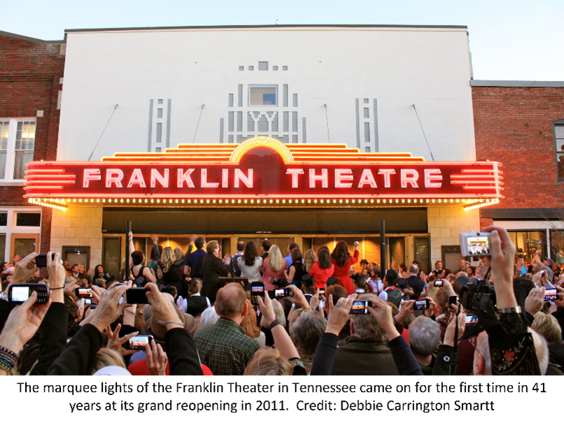
But how do you draft a sign code that cleans up the plastic clutter and at the same time, recognizes the value of historic signs? First, survey historic signs. Develop an inventory of any signs that may be worth saving because of age, historical association, exemplary design, or aesthetic quality. This list can then be used for individual designation and protection.
Some cities permit signs to be designated as historic by the city council or planning commission if the signs meet certain criteria. In Culver City, California for example, a sign can be designated if it is:
• At least 50 years old
• An appurtenant graphic (i.e., it is an on-premise sign, not a billboard)
• Unique and enhances the cultural, historical, or aesthetic quality of the city
• Structurally safe
Once designated, historic signs are deemed in compliance with the sign ordinance regardless of their size, materials, colors, or location.
6. Illuminated Signs
Illuminated signs include all signs with lighting, electronic signs, neon signs and other signs that produce their own light. They pose special problems, most notably light pollution and driver distraction and require special attention and regulation. A lighting ordinance can make a major difference. For example, light fixtures used to illuminate outdoor signs should be mounted on the top not the bottom of the sign structure and aimed downward, not upward. Not only does this reduce light pollution, but it results in more effective illumination of the sign. Lighting fixtures should also be shielded. This keeps the light from intruding on other uses and helps prevent glare, a safety hazard for oncoming vehicles. In certain places, it may also make sense to require that the lighting be turned off at a certain hour, both to save energy and preserve harmony near homes, hospitals, or other sensitive locations.
In recent years, technology has allowed for the creation of electronic and/or digital signs, which can rapidly change messages or images. This type of sign can be particularly annoying and hazardous. They are also very energy intensive. Some communities have chosen to prohibit electronic signs, while others allow them subject to typical restrictions on size, height, movement, etc. As with good sign controls, good lighting standards can help businesses communicate more effectively, while also preserving community character. Education is a key to showing businesses that good lighting standards are in fact, good for business.
Dealing With Non-Conforming Signs
One key issue in sign regulation involves the removal of non-conforming signs. When a community passes a new sign code, many older signs that don’t conform to the new law will remain. These are called “nonconforming signs”. How do you deal with them? There are several techniques for removing non-conforming, on-premise signs. The most common method is to set a specific date by which they must be removed. This process is known as amortization. Businesses are given a designated period (usually between one and five years) during which time, the non-conforming sign may remain. When the time is up, the old sign must be removed or modified to comply with the code. With an amortization provision in place, the owner has time to depreciate the cost of the sign and the municipality does not have to pay for the value of the sign after the amortization period has run out.
Another method for eliminating nonconforming signs is for the ordinance to require that whenever an old sign is removed or modified, it can only be replaced with one that conforms to the current sign regulations. Additional techniques that communities can use to facilitate the removal of non-conforming signs include the following:
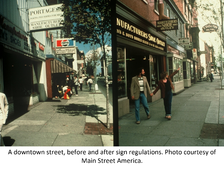
• Provide a size bonus for a new sign, if the old sign is removed by a certain date.
• Prohibit the installation of any new signs on the property while a nonconforming sign remains.
• Prohibit modification or maintenance of nonconforming signs
• Prohibit issue of building permits for the zone lot while nonconforming uses remain.
• Offer to remove the nonconforming sign at no cost to the owner.
• Offer a cash incentive or tax credit for the removal of nonconforming signs.
• Condition any rezoning, variance, or conditional use permit on the removal of nonconforming signs
• Require nonconforming signs to be removed anytime there is a change in the certificate of occupancy or business license for the premise
Brooke Peach, a historic preservationist from Madison Wisconsin, believes that communication should be the bedrock of sign compliance. “For the most part, because the sign ordinance and guidelines are very clear and have been consistently applied and enforced, we have rarely had any sign regulation issues,” she said. “Those we have had, such as signs that were illegally installed with out proper COA permit or building permit, were typically resolved quickly through swift and effective communication that clearly and firmly set forth the regulations, but that also offered mutually beneficial solutions.”
Carl Espy, Zoning Administrator for the Town of Halifax, Virginia has found illustrations to be a useful tool in helping businesses redesign their signs to meet regulations. His office works with businesses to adjust logos and other sign materials to meet town requirements while also arriving at a product that the business is happy with. This reduces the burden on the business while encouraging compliance in the downtown historic central business district.

While there is no legal impediment to effective sign regulation, there is often a political one. Sign companies frequently try to convince local officials that sign control will hurt local business. To counter this tactic, counter-persuasion and education needs to begin early. Planners, main street advocates and local citizens need to educate their local leaders about the advantages of sign control and explain how improving the community’s overall appearance will benefit businesses. If this is done, the business community itself may become the most effective advocate for sensible sign controls.
In Lubbock, Texas, for example, the planning commission was able to demonstrate that sign controls would benefit local businesses, and that smaller signs were more attractive and would cost much less than larger signs. As a result, more than 60 percent of local businesses were in compliance with the sign code before the amortization period ended.
In Baldwin County, Alabama, a local quality of life group commissioned a survey of local residents’ views on sign control, tree preservation, and other community appearance issues. The results: residents strongly preferred smaller signs and more trees and landscaping. The survey helped to convince local leaders that sign control and landscape ordinances were an essential ingredient in enhancing both quality of life and economic vitality.
The State of Vermont is another striking example of the benefits that can accrue from strict sign control. In 1968, Vermont became one of only 4 states to prohibit all off-premise, outdoor advertising (i.e. billboards). When asked about the state’s experience with sign control, a spokesman for the Vermont Travel Division said, “Although there was some initial sensitivity that removing big signs might hurt tourism, it has had the opposite effect. Tourism is up for all businesses, both large and small.”
If you think about it, you will realize that the size of a business sign is one of the least important factors in the success of any business. Almost everything else is more important: the quality of the goods or services, the reputation of the business, the price of the products or services, the ease of access, the friendliness and expertise of employees, the location, the business plan, etc.
There is a famous restaurant in Savannah, Georgia that has no sign at all and yet it is packed every day. The restaurant known as Mrs. Wilkes Dining Room – is famous and successful because the food, service and ambiance are all exceptional. Residents know where Mrs. Wilkes Dining Room is located, and tourists simply need to ask anyone in Savannah, and they will tell you where it is. Failing this, they can simply “Google It” on their smart phone. The truth is that restaurants with giant signs don’t sell anymore or less food that the same ones with smaller, more tasteful signs.
Mark Twain said, “We take stock of a city, like we take stock of a man. The clothes or appearance are the externals by which we judge.” Signs form part of the clothes worn by a city and their appearance is an important part of the way we judge the character of a place. The signs along a city’s streets influence the public’s perception of individual businesses, commercial districts, and the community as a whole. Well designed, appropriately scaled signs can enhance a community’s unique image, while an overabundance of haphazardly placed, oversized, look-alike, plastic signs can detract from the community’s appearance – and ultimately hurt business.
In today’s world successful communities are distinctive communities. Yet almost nothing will destroy the distinctive character of a place faster than uncontrolled signs and billboards. Mick Cornett, the former Mayor of Oklahoma City says that “successful economic development today is really the result of creating places that people want to be.” Sign control plays a key role in improving the appearance of communities and strengthening our attachment to place. This in turn creates a “place-making dividend”, which simply means that people will stay longer, come back more often, and spend more money in places that attract their affection.
.png)